

I drew my whole website in Python
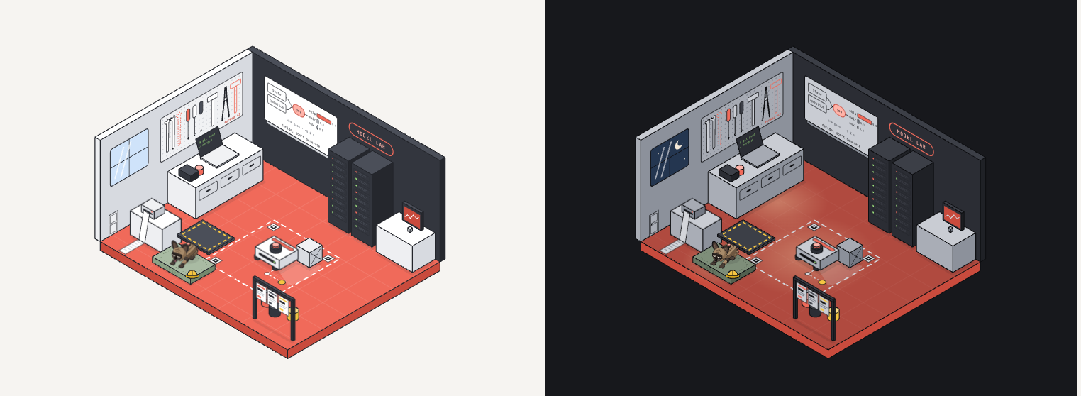
My old site said what I do and showed none of it. This one is a single isometric room, drawn by a Python script, coloured by CSS variables, and walked through over one working day.
My old site said what I do and showed none of it. It had a big headline, a list of services and a contact form, like every other developer site. I like websites that tell a story, and a list of articles would not have shown where my interests are either. So I built a place instead: one robot workshop, one working day, every station one of the things I care about. This is the first shift note, and it is about the workshop itself.

Finding the theme
The first rounds were logos and colours. They were fine and forgettable. What fixed it was a place, not a style: a workshop where each interest has a station. The tool wall is open source, the robot arena is robots and physical AI, the model lab is language and decision models, the paint shop is interfaces and landing pages, the factory downstairs is how I build software with agents, and the label printer by the door prints the production log, which is my CV.
A place also gave the site a voice. A serial builder in a workshop has shifts, parts, quality control and a supervisor. The supervisor is Abby, my French bulldog, drawn as a robot.
Why code, not stock art
I wanted vector art I could change by editing one number, colours that come from CSS so the whole room can switch theme, and parts that can move. Stock illustrations give you none of that, and image generators give you a picture you can't edit. So the art is generated by a small Python script, and every colour in it is a CSS variable such as var(--w1) or var(--a2).
The trade-off is a ceiling. Boxes, panels and cables are easy in code. Organic shapes are hard, and I hit that ceiling the moment I started on Abby.
Isometric projection in a few lines
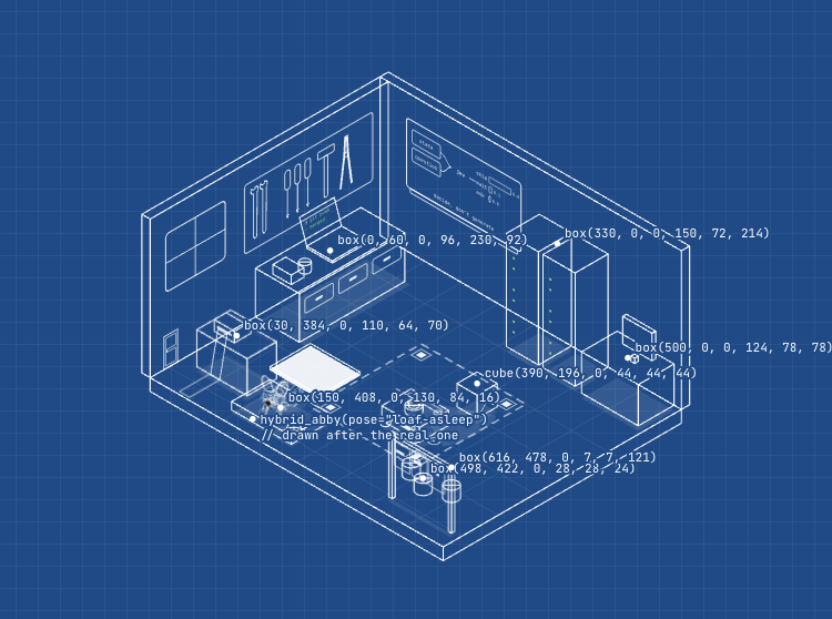
The whole room rests on one function. A point in the room, x and y on the floor and z up, becomes a point on the screen:
C, S = math.cos(math.radians(30)), 0.5

def P(x, y, z=0):
    return (ox + (x - y) * C * k, oy + (x + y) * S * k - z * k)
Everything else is built from boxes. A box is three polygons, the side facing you, the side facing right and the top, each in a lighter or darker tone of the same colour. That flat shading and one outline weight are the whole style.
def box(x, y, z, w, d, h, tone="w"):
    top, front, side = TONES[tone]
    poly([(x, y+d, z), (x+w, y+d, z), (x+w, y+d, z+h), (x, y+d, z+h)], front)
    poly([(x+w, y, z), (x+w, y+d, z), (x+w, y+d, z+h), (x+w, y, z+h)], side)
    poly([(x, y, z+h), (x+w, y, z+h), (x+w, y+d, z+h), (x, y+d, z+h)], top)
The script draws in order, back to front, so whatever comes later covers what came before. Flat things on walls (the whiteboard, the tool wall, the window) are drawn once flat and then mapped onto the wall with a single transform. The website uses the same function, with the same numbers, so anything that moves on the page lands exactly on the floor of the drawing.
Abby, the hard part
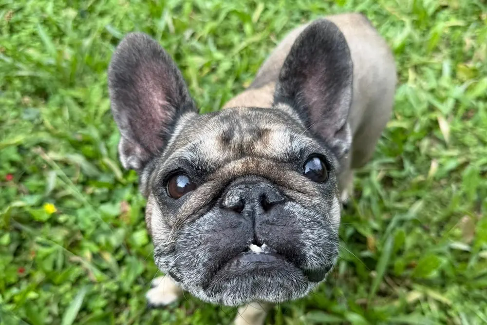
Abby took more rounds than the rest of the room together. A flat cartoon looked cheap. Shaded 3D ellipsoids still looked cheap. A full robot dog was closer, but it was not her. A real Frenchie head on the robot body was nearly there: her round skull and dark mask, her bat ears, a body of plates and joints. The last step was a dark visor across her eyes, which ties the head back to the robot and lets the eyes stay two simple shapes that still show a mood.
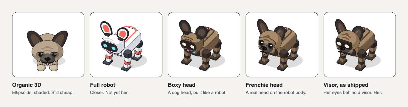
What I learned: realism lives in the head. A robot body forgives simple shapes, so it can stay in the same box style as the room. And every pose, sitting, walking, asleep on her cushion, belly up when you pet her long enough, is built from the same parts, so she looks like the same dog in all of them.
One room, one day
The page is one drawing, inlined once and shown through different windows. Each station is a camera frame on the same room. Scrolling moves the camera from one frame to the next while a clock runs from 08:00, doors open, to 18:00, lights out. Abby walks between the stations around the furniture, and at the end of the day she goes back to her cushion.
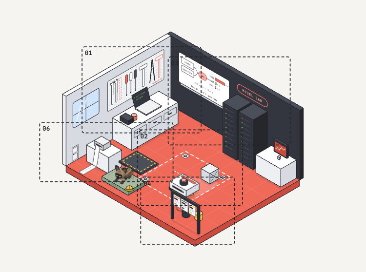
The factory, station 05, is the exception: it is a basement under the workshop, and Abby rides the rover down a lift to get there.
The logo, and why small sizes are a different drawing
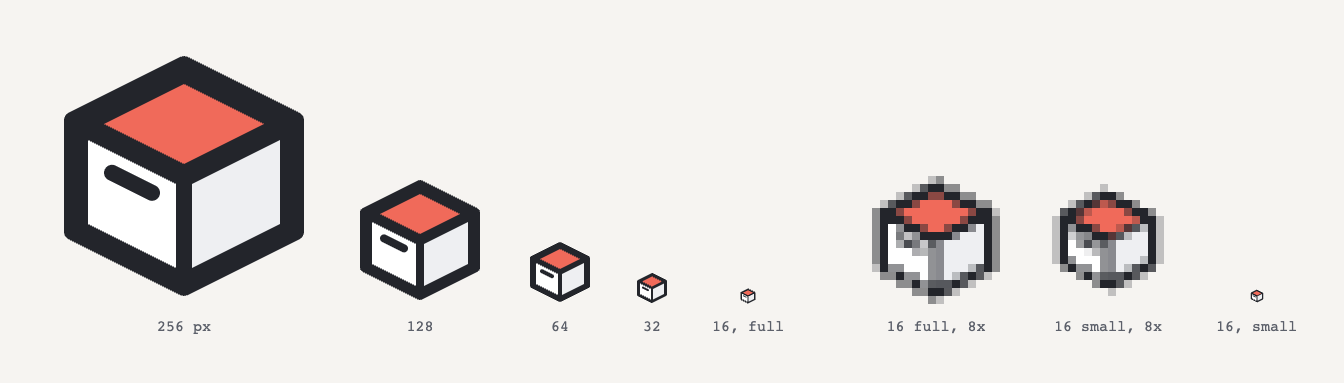
The logo went through six concepts before the open crate won. It works at 256 pixels and falls apart at 16: the handle becomes a smudge and the outline eats the faces. So the small sizes are a separate, simpler drawing, the way type designers draw small sizes of a font differently.
Dark mode, almost for free
Because every colour is a variable, the night shift is mostly a second set of values. The extras are what make it feel like night: a moon in the window, warm light from the lamps, small LEDs that glow, and Abby asleep. The lights switch reveals the new theme in a circle that grows from the switch.
Things to find
I won't list them all. The rover plans its route with real path finding. Abby has moods, and she likes treats. There is a door that does not open the first time you try it. The 404 page is an empty crate. And if you press X on the homepage, the room shows you how it was drawn.
Making it fast
A drawing you can scroll through is still a web page, and I did not want a beautiful one that loads like a slow one. So I measured it on a production build, on a laptop and on a phone profile (Fast 4G, a CPU four times slower), and went after the biggest numbers first. Nothing on the page changed.
| Phone, homepage | Before | After |
|---|---|---|
| Downloaded | 1.1 MB | 0.59 MB |
| Largest paint | 4.3 s | 0.9 s |
| Other pages, downloaded | 0.7 to 1.7 MB | 0.33 to 0.41 MB |
| Other pages, largest paint | 2.5 s | 0.5 s |
What I learned, in the order it paid off:
- Generated art carries the generator's habits. Abby weighed more than all three rooms together: 1 MB for twelve poses. The script turns every curve into hundreds of short lines with two decimals, and draws every clipped shape twice. A small step on export now simplifies the outlines (never further than a quarter of a unit, under half a pixel at the largest size she is shown), writes the paths with relative, one-decimal numbers, and writes each shape once. She is 0.36 MB now. I rendered every pose before and after at three times her size and compared the pixels: under one in ten thousand differ, all on the edges.
- Hidden is not free. The room still carried the Abby the script draws into it, 143 of its 186 KB, switched off with
display: nonesince the site started drawing her itself. The browser downloaded and parsed her on every page. Now she is gone from the file. - Inline SVG is paid twice. With React Server Components, everything a server component renders goes into the HTML and once more into the data React uses to take over the page. Every kilobyte of art counts double, which is why slimming it mattered so much.
- Prefetching is not free either. The "Workshop" link in the header prefetched the whole homepage, art included, on every page, even on the homepage itself: 1.5 MB of data, mostly never used. It now prefetches when you point at it. And a prefetched note pulled in its figures too, so the notes list downloaded 1.5 MB of pictures nobody looked at. The figures are lazy now, and WebP: a third of the size, and all but two of them pixel for pixel the same.
- A fade can hide your page from the browser. The first-load animations started at opacity 0. Chrome does not count content painted at opacity 0 as the largest paint, so it recorded the page 1.6 s late, when the animation ended, although you could see it after a few hundred milliseconds. Starting at 0.01 looks the same and fixed the number.
- Fonts: only the letters you use. Each font loaded an extended Latin set as well. The site needs none of it, not even for the German pages.
The game in the yard had its own lessons. The room's furniture is drawn in front of Abby and the rover by clipping extra copies of the whole room, and copies hidden with visibility still cost the browser work on every frame. Hidden with display they cost nothing. While the game is open, the page behind it now pauses (content-visibility: hidden), and the sunset blends the colours only inside the game. The sunset went from about seven frames a second to a smooth sixty.
What is left: on a slow phone the homepage still keeps the main thread busy for about a second while it reads a 1.8 MB document. The next step is to serve the art as files the browser caches once, instead of inlining it into every page.
How it was made
I worked on it in rounds over a weekend: pick a direction, look at it, change what bothers me, next round. The result was not a mock-up but a package: a written spec, the Python generator and the assets it exports. I built the site from that package on top of my own site template, then grew it in small steps, one feature or fix at a time, each one checked in a real browser.
What worked was the order. The look was settled as drawings before any page existed, and the spec said what the site should do in plain sentences. What I would do differently: decide the art's coordinate system and the website's together from the start. Some of the most fiddly work later was making things the site draws, like Abby and the rover, line up exactly with things the script drew.
The generator stays private for now. The site is on my own tool wall, which is the point.